Dzherelo: A history of common purpose and human centrism
27 August 2024

Modern realities present us with challenges, and overcoming these obstacles is possible only by working together.

Client
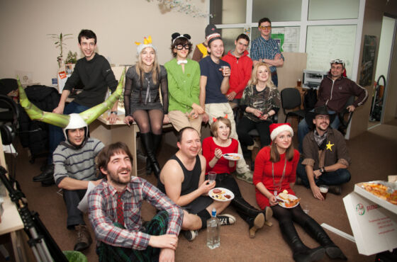
Dzherelo is an exemplary training and rehabilitation center that has existed for many years for those it cares for. The employees of the center are a community that believes in changing attitudes towards people with needs. They strive to destroy stereotypes because they are an important part of our society that deserves support and love.
Dzherelo becomes a hope for a better future, reflecting colossal experience and a united approach to solving social problems.

Tasks and challenges
The idea to unite Dzherelo with municipal institutions and apply Dzherelo standards to them was born against the backdrop of the war. This is how a large-scale unified center appeared, which will provide a wider and better range of social services.
The studio faced the task of portraying the integration of Dzherelo and other social services in the identity, emphasizing their vocation to serve people here and now.

With the appearance of the United Center, donors and employees faced with a challenge. How to maintain the high standard of service provision developed in Dzherelo before the unification? Our goal was to prove that unification= improvement, as users will have access to better services, employees will get new development opportunities and jobs, and donors will be confident in strengthening cooperation and its positive impact on society.

Processes and results
A sense of people-centeredness and mutual support was embedded in the brand’s DNA. We reflected it in everything, from the identity to the strategy of Dzherelo.
With the identity of the brand, we personified diversity, which was intertwined with integrity. Each part of the logo is autonomous, but when superimposed, it forms a community, symbolizing unity and cooperation. The color palette reflects the different directions of the center’s work. The soft forms show interweaving and support as if forming a common framework that holds everyone together.
If you look closely at the logo, you can see the letter “Ж” formed from a combination of abstract shapes. And this is not an accident. It acts as a source and as a part of the word, and at the same time is an allusion to the Old Slavic alphabet and our roots.

Communication with different audiences became an important stage, and every step was aimed at supporting people in need of help. Bambuk held a brand sprint to clarify the common goals of the center. An important stage was communication with representatives of the city council, consumers, parents of children with functional needs, and people with disabilities, thanks to which it was possible to understand the fears and pains of each category.
Planning
That is why we started the change process with phased planning, which was divided into three main stages:
1) Communication of the merger: the main task was to convey to the people that the unification would lead to an improvement in the quality of services.
2) Acquaintance with the activities of the center: consumers and partners had to get to know the philosophy of the new center and understand its audience.
3)Call for cooperation with the updated Dzherelo: the main goal was to convince everyone that although the format of the center has changed, the quality has remained consistently high.
After that, the concept of the “105 number” was born, which is the availability of information like the well-known emergency numbers. The purpose of this metaphor is to emphasize that people should know about Dzherelo as well as about the ambulance, rescuers, or the police.
From now on, a person who finds himself in difficult life circumstances does not need to run with stacks of documents from office to office because it will all be ready centrally for him without too much trouble.

Dzherelo in numbers
In 2023, the Dzherelo developed significantly through reorganization and merger with four social institutions in Lviv. This step improved access to 20 types of services for more than 6,000 residents of the Lviv community.
After the merger, Dzherelo:
- strengthened its capacity and influence by increasing the number of locations from 6 to 22
- increased the team from 170 to 500 employees
- increased the number of service users from about 350 people per month to more than 3,400
- reached 10,306 residents of the Lviv community with its services in November-January
The center was opened:
- a contact center for people in difficult life circumstances
- a center for assistive technologies for families raising children at risk and with disabilities
- a shelter and crisis room for victims of domestic violence
- a day care center for the older people
- first renovations in various premises to expand the range of services provided
Particular attention was paid to social support for veterans, internally displaced persons and other people in need of assistance who were in medical institutions in Lviv. Active work is also underway to renovate the Assisted Living Center and open new day care branches.
In January of this year alone, 855 community members were enrolled to receive social or rehabilitation services.

Conclusions
The result of this project was a united, strong team ready to provide quality social services, trust in the center as a guarantor of help in difficult situations, and consumers who knew exactly where to turn in difficult moments.
The new positioning of the brand emphasizes the change of formats without changing the quality of the services provided. The identity became the beginning of a new story, uniting the goals, standards, and values of the center.
To be continued…